Table of contents
- Accordion List
- Alert
- Bottom Nav Bar
- Details Menu
- Dropdown List
- Flight Cell
- Header Bar
- Input Field
- More Options Icon
- Popup Window
- Toggle Switch
- Top Nav Bar
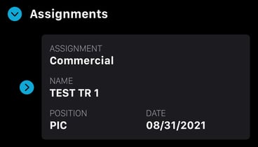
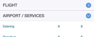
Accordion List
Definition: A vertical list of items that can be expanded to reveal more content and collapsed to condense information.
Example: Pressing the "Assignments" title in Licenses (Crew/Dispatch app) or pressing the "Airport/Services" title (Sales app).
Licenses (Crew/Dispatch app)
Quote (Sales app)
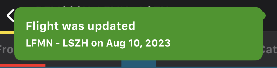
Alert
Definition: A brief message or icon that appears within the app, informing users of updates, errors, or other relevant information.
Example: After boarding passengers (Crew/Dispatch app), you will get a notification to inform you that the flight has been updated.
Bottom Nav Bar
Definition: A horizontal bar at the bottom of an app, offering direct links to core sections.
Example: Use the bottom nav bar to quickly switch between "Calendar," "Licenses," and "Profile."

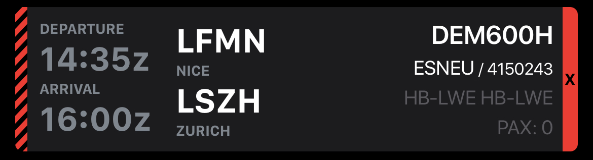
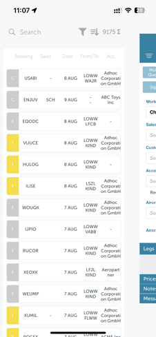
Flight Cell
Definition: An individual container holding information about a flight.
Example: In the Calendar page (Crew/Dispatch), you will find each flight represented by a flight cells.
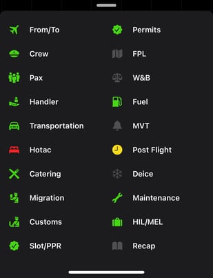
Details Menu
Definition: The menu providing shortcuts to each section of a flight in the Crew/Dispatch app.
Example: Tap a flight cell to open this menu (Crew/Dispatch app).
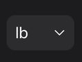
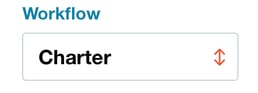
Dropdown List
Definition: An interactive UI element displaying a list of selectable options when tapped.
Example: Click the unit's field to select a unit of measure.
Units field (Crew/Dispatch app)
Workflow field (Sales app)
Header Bar
Definition: The top section of an app or page displaying its title and offering various actions or navigation options.
Example: Refresh the page by pressing the arrow (Crew/Dispatch app) or create a new quote by pressing the "+" icon (Sales app).
Calendar page, header bar (Crew/Dispatch app)

New quote, header bar (Sales app)

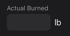
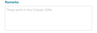
Input Field
Definition: A box where users can type or input information.
Example: Enter the "Actual Burned" in Post flight (Crew/Dispatch app) or adding remarks in a quote (Sales app).
Input field (Crew/Dispatch app)
Input field (Sales app)
Left-Hand (LH) Menu
Definition: A vertical navigation panel placed on the left side of the interface. It contains links or buttons that direct users to different sections of the application.
Example: Use the left-hand menu to navigate between quotes in the Sales app.
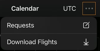
More Options Icon
Definition: An icon, typically represented by three vertical or horizontal dots, that reveals additional actions when clicked.
Example: Press the more options icon in the Calendar page to access requests or download flights (Crew/Dispatch app).
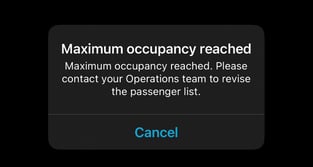
Pop-Up Window
Definition: A small window or box that appears over the main app screen, usually displaying additional information or prompts.
Example: When trying to board more passengers than allowed, a popup will appear (Crew/Dispatch app).
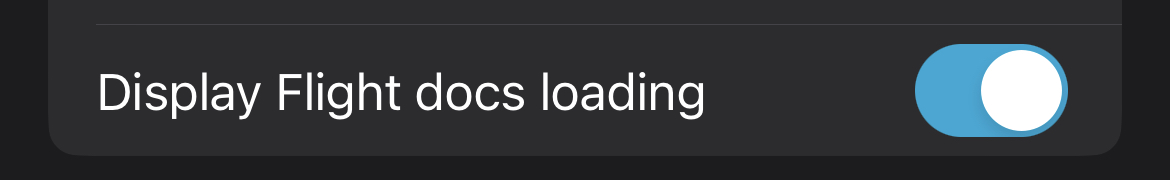
Toggle Switch
Definition: A UI control that allows users to switch between two states, often represented as "on" and "off".
Example: Use the toggle switch in the settings to enable or disable the display of flight docs loading (Crew/Dispatch app).
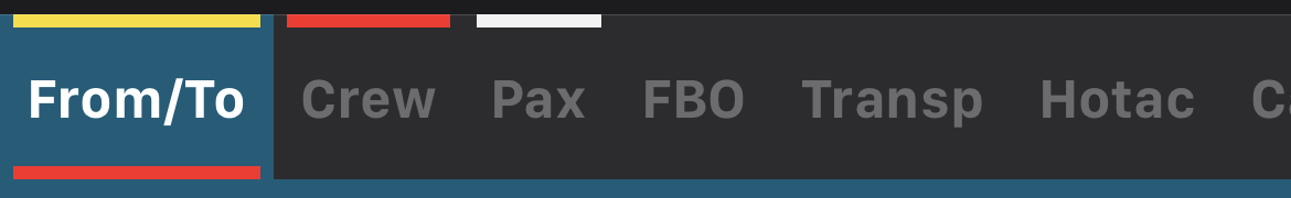
Top Nav Bar
Definition: In the flight details (Crew/Dispatch app), the horizontal bar at the top of the page, providing links to the different sections of a flight.
Example: Tap "Crew" on the top nav bar to view crew information. You can tell which section you are in by the blue highlight.