
Table of contents
- Collapsible Panel
- Control Buttons
- DDL (Drop Down List)
- Filters
- Flight Strip
- Header
- Itinerary Table
- Left-Hand (LH) Menu
- Navigation Menu
- Notification
- Page (UI Element)
- Panel
- Popup
- Radio Button
- Sorting
- Switch
- Table
- Table Headers
- Tabs
- Top Navigation Menu
- Tooltip
- User Menu
- Workflow Buttons
Collapsible Panel
Definition: A collapsible panel is a UI element that can be expanded or collapsed to reveal or hide its associated content. This makes it an excellent tool for optimizing space and managing large amounts of information within a confined area.
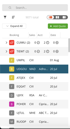
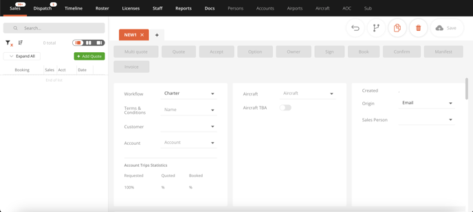
Example: In the Sales page, you can see the relevant data in the collapsed panel. For more details, you can click on it to reveal more information.

Control Buttons
Definition: Control buttons are UI elements typically located at the top right of the interface that provide quick access to commonly used functions such as save, delete, duplicate, undo, and more.
Example: Imagine working on a quote in the Sales page of FL3XX. You make some adjustments and now you want to save your progress. That's where the 'Save' control button comes into play. Likewise, if you want to duplicate the quote or delete it entirely, you would use the respective control buttons.

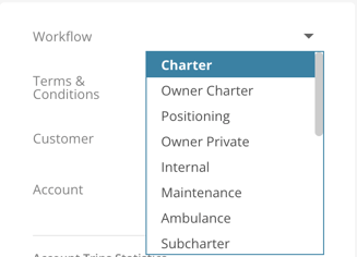
DDL (Drop Down List)
Definition: A DDL is an interactive UI element that expands to display a list of options when clicked.
Example: Selecting your workflow in the Sales page.
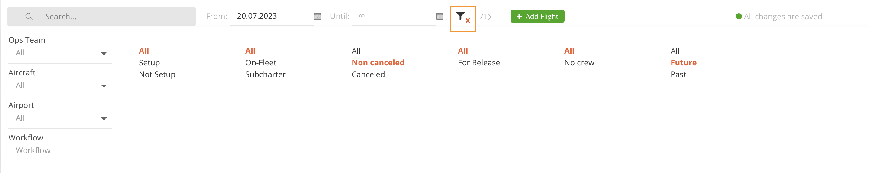
Filters
Definition: The filter function allows users to limit displayed data based on selected criteria. A red "X" appears when filters are active. Pressing it will clear them.
Example: In FL3XX, you can use filters to view only non-canceled flights. Click the red "X" to clear all the filters.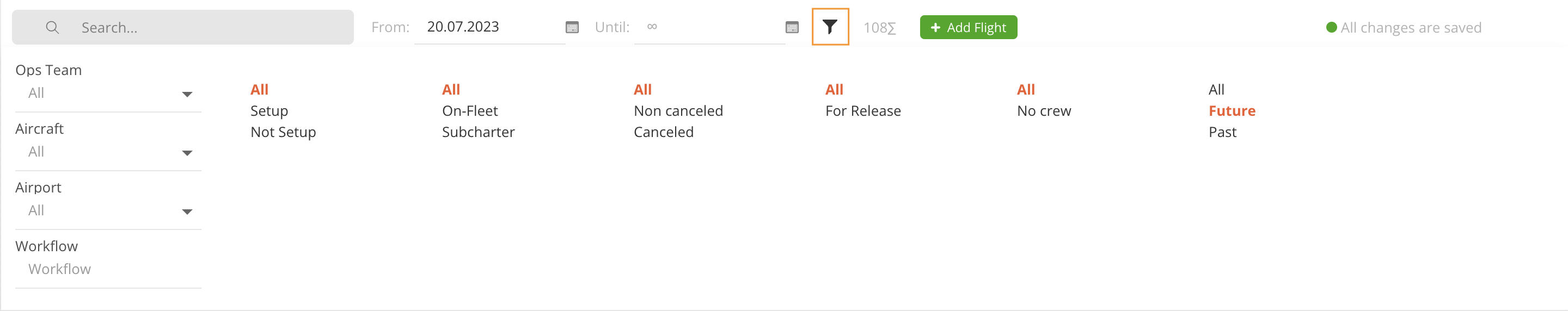
Flight Strip
Definition: The Flight Strip refers to the primary operational workspace within the FL3XX app.
Example: When managing and coordinating flights, the Flight Strip is where you will find all the necessary tools and information in a streamlined layout.

Header
Definition: The header is the topmost part of the FL3XX interface, functioning as a constant reference point.
Example: It displays essential information and options such as the FL3XX logo, time zones, and your personal user menu.

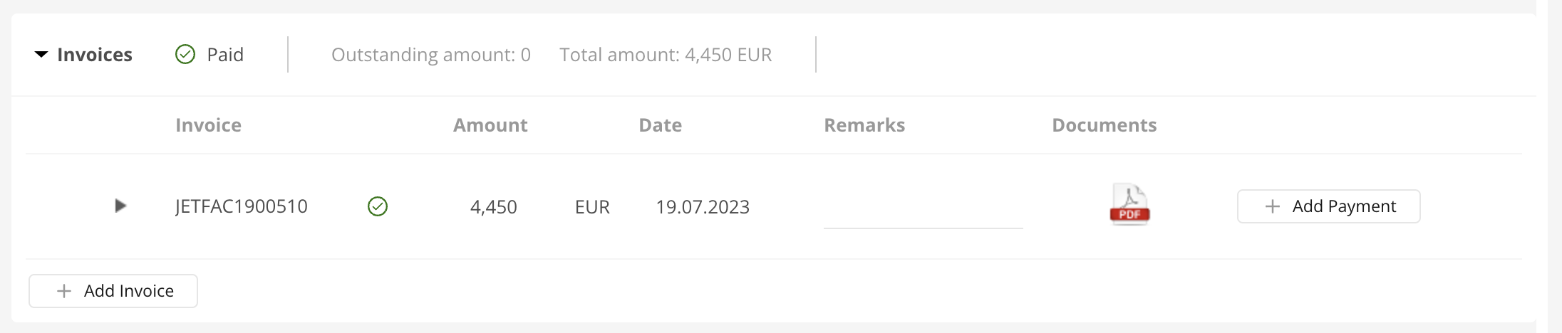
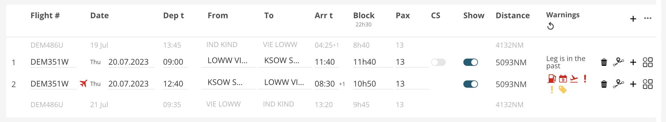
Itinerary Table
Definition: In the Sales page, the itinerary table shows a detailed sequence of flight legs for a booking. It contains the times, dates, locations, number of passengers and can display warnings related to individual legs.
Example: The itinerary table in the Sales page is your booking's overview. Each row is like a different journey, listing the details of each leg of your booking. Think of it as your a flight blueprint.
Left-Hand (LH) Menu
Definition: The Left-Hand (LH) Menu is a vertical navigation panel placed on the left side of the interface. It contains links or buttons that direct users to different sections of the application.
Example: The LH menu is like your library. It contains links to each book you might need. These books can be for example quotes in the Sales page or airports in the Airport page.
Navigation Menu
Definition: A navigation menu consists of clickable titles that direct users to specific sections of the page based on the title selected.
Example: The navigation menu in the "Persons" page.
Notification
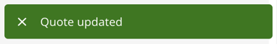
Definition: A notification is a UI element that alerts users about updates, warnings or errors. It will appear on the bottom right of your screen.
Example: The validation notification appearing when you update your quote.
Page
Definition: A page is like a whole new world within our app. It's a standalone part of a website or application that users can navigate to.
Example: In FL3XX, 'Sales' or 'Dispatch' are different pages in our application.
Panel
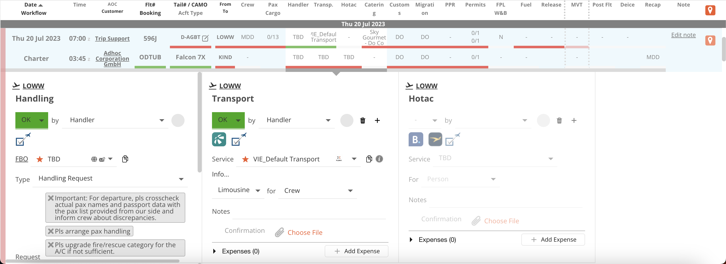
Definition: Panels are subdivided areas on a Page, dedicated to specific content or functionalities.
Example: On the Dispatch page, Handling and Transport are housed in separate panels.
Popup
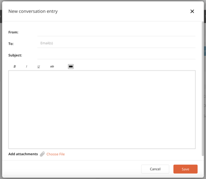
Definition: A Popup is a small window that appears over the main application window, used to display important messages or prompt user action.
Example: When you want to create a new conversation entry. A popup will appear for you to interact with. You can move the popup by clicking and dragging the top part of the popup (where the title "New conversation entry" appears).
Radio Button
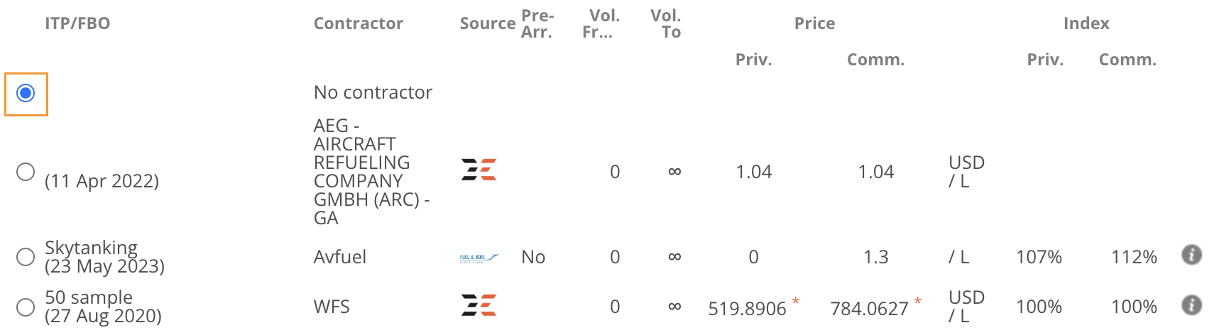
Definition: Radio buttons are selection controls that allow users to choose only one option from a set.
Example: Selecting a fuel provider in the fuel panel of the Dispatch page.
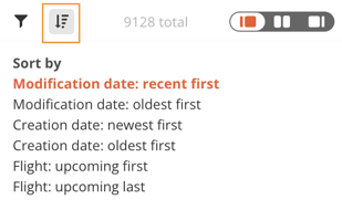
Sorting
Definition: The sorting function allows users to arrange displayed data in a particular order, typically ascending or descending, based on selected data fields.
Example: In the Sales page, you can sort bookings by modification date, creation date or upcoming flights.
Switch
Definition: A switch is a binary UI control that allows users to toggle between two states, such as on/off or yes/no.
Example: Show subcharter flights in the Timeline page.
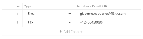
Table
Definition: A table is a UI element that organizes and displays data in rows and columns, facilitating comparison, organization, and understanding of large amounts of information.
Example: A table can take different forms but the principle is the same. The "Contacts" table in the Persons page is just as much of a table as the one in Dispatch.
Contacts table in Persons page
Flights table in Dispatch page
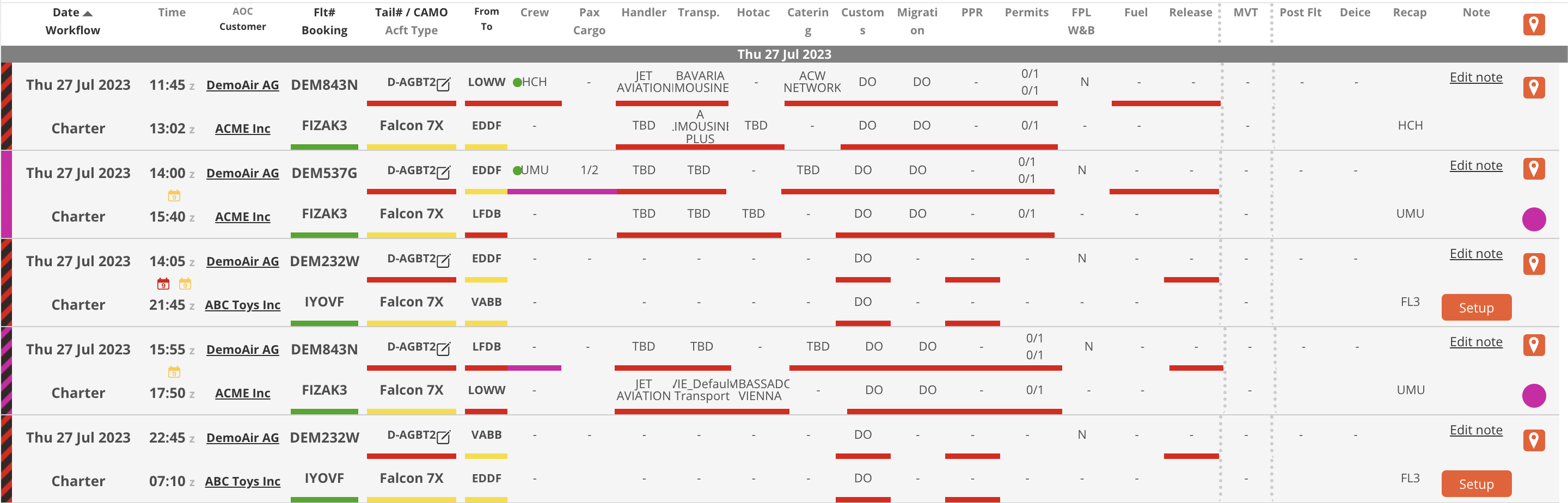
Table Headers
Definition: The table headers are the bold, descriptive labels found at the top of each column in a data table. They provide context for the information contained in the columns below. The dark ones are clickable to sort by.
Example: In the Dispatch page, your flights will be sorted by ascending dates by default. Clicking that header will sort by descending dates. This works for any other title in dark and bold.

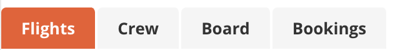
Tabs
Definition: Tabs are UI elements used to separate content into different sections within the same screen, page, or window. Only one tab's content can be visible at a time, and users can switch between tabs to view different content sections.
Example: In the Sales page, each quote has it's own tab. Or in the Timeline page, each tab has its own Timeline view.
Sales tabs
Timeline tabs
Top Navigation Menu
Definition: The top navigation menu is a offers direct links to all main pages of the FL3XX app.
Example: This horizontal bar, situated below the Header, allows users to navigate swiftly between different pages like Sales, Dispatch, Timeline and more.

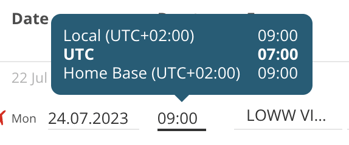
Tooltip
Definition: A Tooltip is a UI element that provides brief, helpful information when a user hovers over or focuses on a specific item. It is typically used to explain the function of a button or other user interface feature.
Example: Picture yourself hovering over a mysterious field in FL3XX. Just as you begin to scratch your head, a tooltip appears like a friendly co-pilot explaining what it does.
Time tooltip in Sales page
System Emails From tooltip in the Settings page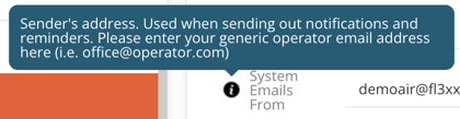
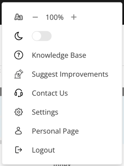
User Menu
Definition: The user menu is a personalized DDL offering various user-specific options and settings. You can open it from anywhere by clicking your name in the header, on the right.
Example: You need help understanding a feature. You click your name and access FL3XX's knowledge base to find the page related to that feature.
Workflow Buttons
Definition: The buttons used for at the top of the Sales page to process your quote at different stages.
Example: The "Quote" button.
